YouTube Music Rolls Out Subtle, Sophisticated Menu Updates
By HiFi Editorial24 February 2026

Key Highlights
Updated three-dot menu design with rounded edges adds minimalistic sophistication.
Monochromatic “Connect to Cast” button enhances focus on album art.
Web version now supports seamless playback continuity across sessions.
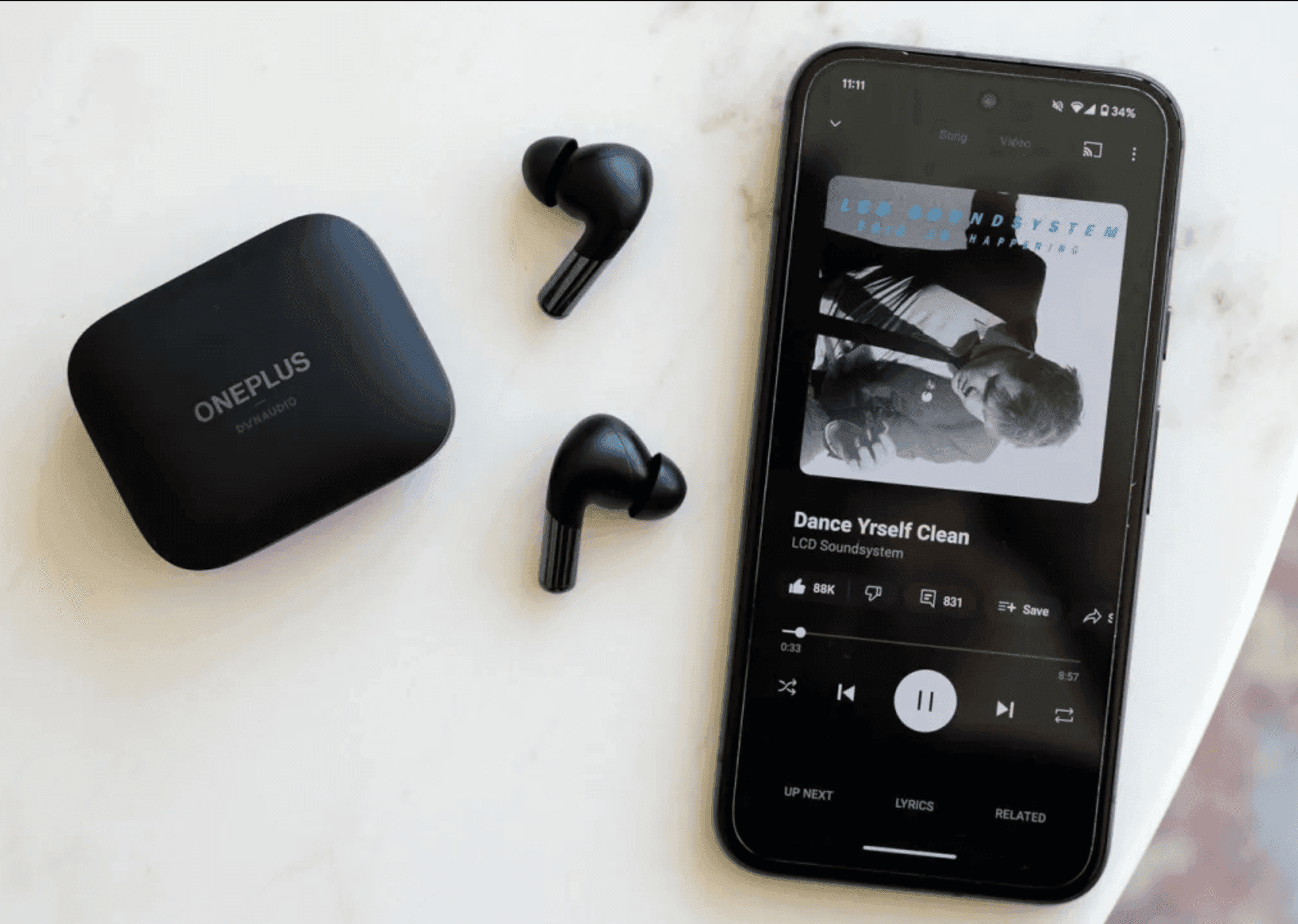
YouTube Music’s latest update introduces subtle but thoughtful changes aimed at delivering a more refined, immersive user experience that resonates with detail-oriented listeners. The refreshed three-dot overflow menu now floats with rounded edges rather than stretching across the screen, echoing the minimalist yet polished approach seen in other premium audio interfaces. Dark themes may render the change understated, but it adds a touch of sophistication that seasoned users will appreciate.
On Android, this upgrade excludes only the share function, which retains the previous design, while iOS users get the full, updated experience. These adjustments streamline the interface without overshadowing the core content, keeping the focus on the music itself—a small nod to what dedicated listeners value in their digital environments.


